A local landing page is a web page designed to show people and search engines where businesses operate. It can include details on the service area a business covers, directions to a physical shopfront, and information about the staff and services available at that location.
You may have heard that Google doesn’t like to rank such pages, which isn’t necessarily true. What Google doesn’t like is:
- Mass-produced local pages that prioritize quantity over quality
- Creating location pages for areas your business has no tangible presence in
- Duplicated content with just the location swapped out
- Regurgitated Wikipedia information about the history of a location
So, let’s unpack the anatomy of a location page strategy that not only ranks and converts but also enhances your credibility in your local community.
Great location pages ensure that your business appears in local search results and resonates with the local audience.
Here’s a blueprint you can follow to create location landing pages that rank well, offer valuable information, and help drive new business for your local company.
We suggest using most of the elements listed below, along with tailoring the design to meet the needs of your business and your customer’s search intent.
Now, let’s unpack each of the six elements of effective location pages.
Adding local keywords to your URLs is a ranking factor that can assist with improving location page rankings. It’s critical to include both your service and location in the URL to match your target keywords for the page.
There are a few ways you can go about this.
For instance, a URL like www.example.com/emergency-plumbing-new-york is only one level down from the home page. Creating all your pages like this leads to a very flat website structure which can be harder for users to navigate and for businesses to organize and track. It can also make it harder for Google’s crawlers to pinpoint which website pages you view as the most important.
A better way to go about this is to create parent and child pages.

If your business operates (or will operate) nationally, across multiple cities, or as a franchise, make your locations the parent pages:
If your business operates (and will continue to operate) at a small local level or within only one area, make your services the parent pages:
The best choice for your business comes down to what website structure can scale to accommodate your business needs over time.
Adding your service and location to the H1 heading and title tag can help with search rankings, clearly signaling to Google which topic your page is about. It is also better for accessibility and user experience by helping all users know the page they’ve landed on is likely to provide the information they’re after.
However, there can be a tug-of-war between optimizing for SEO and writing compelling copy.
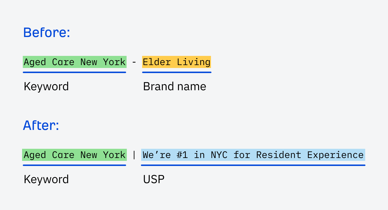
The best balance comes from leading with the keyword you’re targeting and following with a unique selling proposition to encourage people to choose your business over a competitor’s. For example:
- New York Aged Care | We’re #1 in NYC for Resident Experience
- Plumber Manhattan | 24/7 Emergency Plumbing across New York
- Extension Builders NYC | Fixed-Fee Home Extensions With No Hidden Costs
- Carpet Cleaning New York | $99 Fixed Fee Service
A website’s home page tends to get a whole lot of love from designers compared to other internal pages. But in reality, many people will find your website through your location landing pages first, and may not even see your homepage.
For this reason, it’s important that you design your local pages with the best user experience and conversion potential in mind.
When someone lands on your location page, they will immediately see the “above-the-fold” region. This is the entire area visible on someone’s screen before scrolling, and it is a goldmine for conversion potential.
For instance, here’s what the above-the-fold area of Parris Law Firm’s Lancaster car accident page looks like:
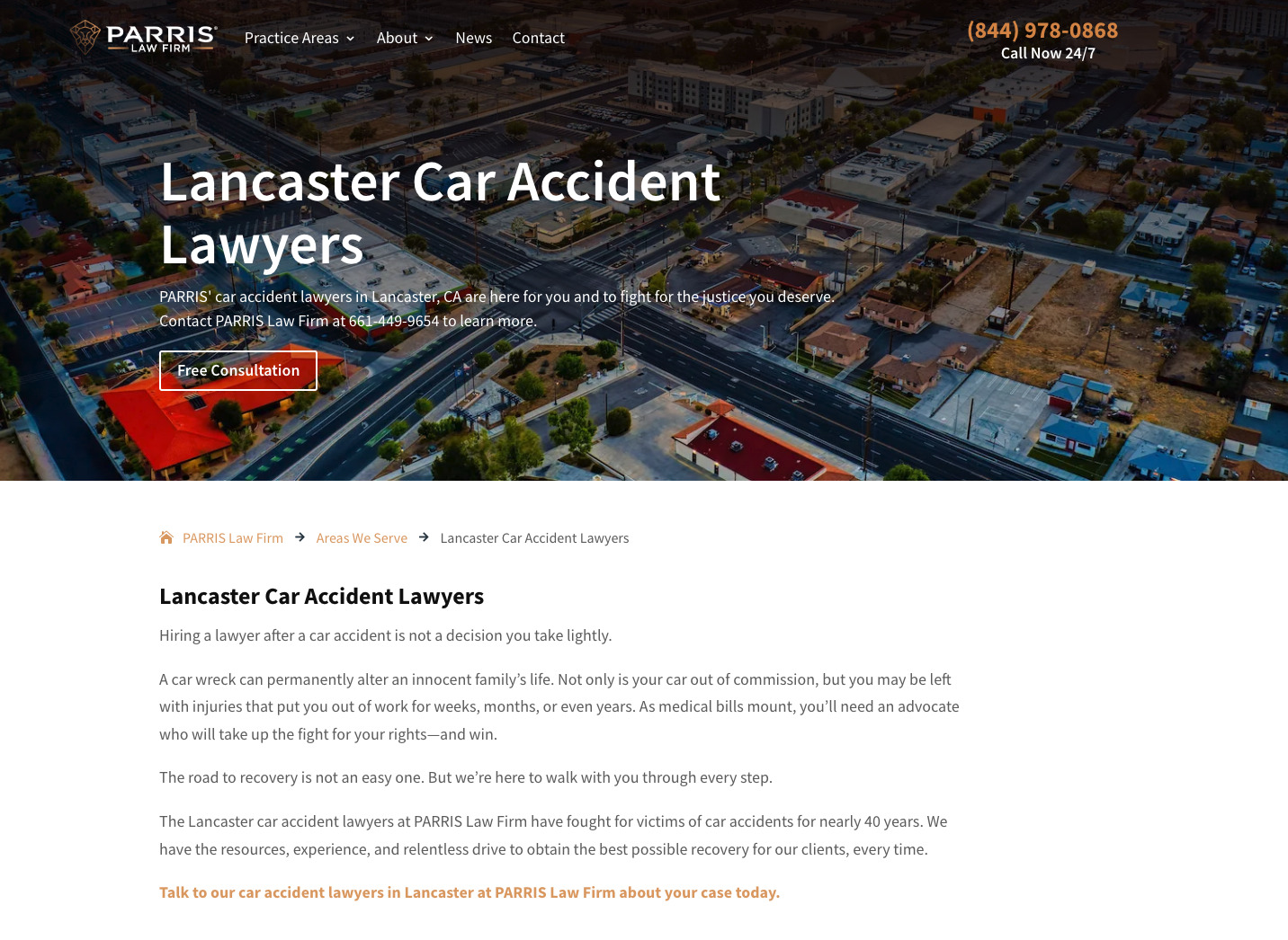
Notice how it doesn’t particularly inspire feelings of trust or credibility? The call to action button is also hard to see against the background and the visually dominant content doesn’t indicate why a visitor should choose Parris over another firm.
Now compare that to their home page which notably includes many credibility and conversion-optimized signals like the reviews, proof of results generated, the media mentions the firm has earned, and mentions of how long they’ve been in business.
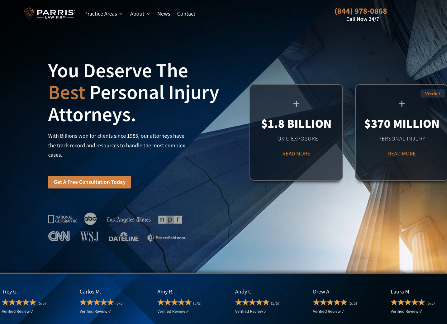
It’s clear the same level of attention has not been given to designing each of these pages. Since people will generally land on a location page directly after making a Google search, the above-the-fold area must be designed to keep people’s attention on the page and encourage them to convert.
To improve the conversion potential of your location pages, consider:
- Highlighting your unique selling points. Use content and design elements to make your points of difference stand out.
- Showcasing aggregated reviews. You can embed these from third-party platforms like Google Business, FaceBook, or Yelp.
- Meeting the searcher’s intent. If users intend to continue the journey offline, address that and make it easy for them to do so.
- Showing you’re actually based in an area. When searching locally, many people choose businesses near them.
- Having clear calls to action. Make buttons clear and support them with well-written conversion copy.
Don’t only focus on SEO here. Write to convert users.
“Show, don’t tell” is powerful advice that also works wonders for location pages. It’s easy to say you’re in an area, but consumers are becoming increasingly distrustful of dishonest or manipulative marketing tactics.
Here are some elements to consider adding to your page design to showcase your local presence.
Add a map
Add a map with a pin showcasing your location if you have an office or bricks-and-mortar shopfront.
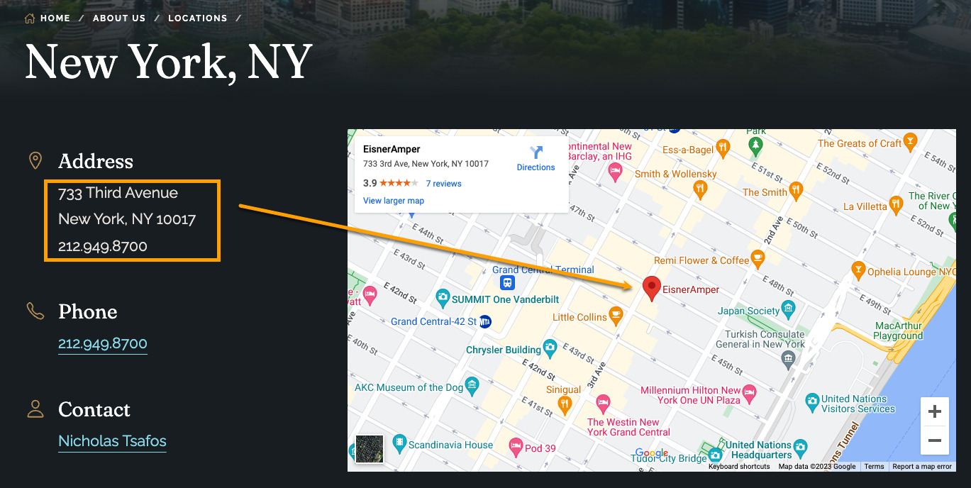
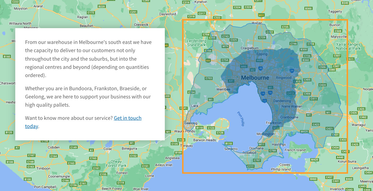
If you operate in a particular area but don’t have a bricks-and-mortar location, add a map highlighting your service area instead, like this example from Plain Pallets:
If you operate a bit like a school, where you may have physical premises in one area but also connect to nearby locations (like school catchment areas), you can add a map with driving directions to your site.
Or you can showcase how your premises are “only X minutes from Y area,” along with the best ways to reach your location.
Add images of your premises
Real photos are much more persuasive than stock images. For example, this image, from Sheen Panel Services contains an image of the truck in the act of delivering a towing service. It also includes a branded logo, and contact information, and is an actual representation of the service the company delivers.
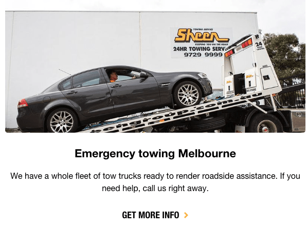
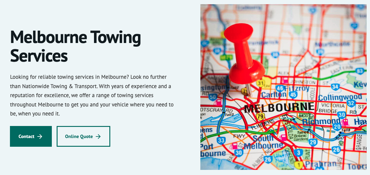
Compare it to this stock image from another towing company. It doesn’t add value to the page or experience and will likely be ignored by most people. It also doesn’t support the content or service mentioned.
Using Sheen as an example, here are additional image ideas you can add to your location pages to bolster your local credibility and earn more trust online.
External shots of the location, ideally with your logo visible in the frame
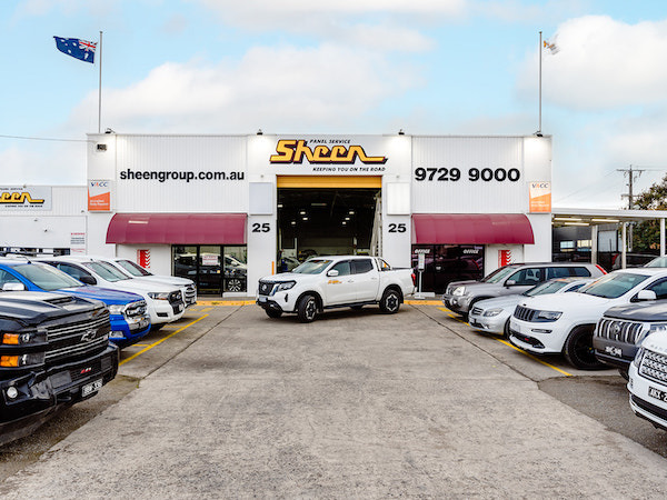
These types of photos are great for shopfronts or businesses that require customers to travel to their location. It is ideal to include the entire exterior of your premises with your logo clearly visible, like in this example:
Internal photographs of the reception area
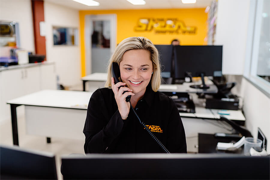
Some images showing your reception area and friendly staff can create a warm feeling before a potential customer sets foot into your location. It is ideal to showcase your logo and smiling, uniformed staff like in this image:
Photos of each team member who works at the location
Adding images of your staff at each location creates a sense of familiarity and continuity between online and offline experiences. You can include such images in a couple of different ways.
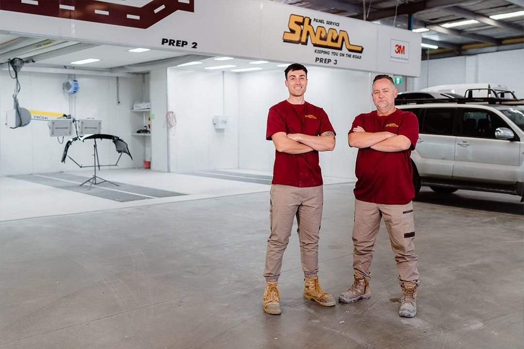
For a business like Sheen Panel Service, you can take images of your team in the area where services are delivered, like in this image:
Alternatively, professional service firms or businesses that have a mix of on-the-ground and virtual staff attending to different offices may benefit from headshots like these from Liston Newton:

Close-ups and detailed shots related to the service
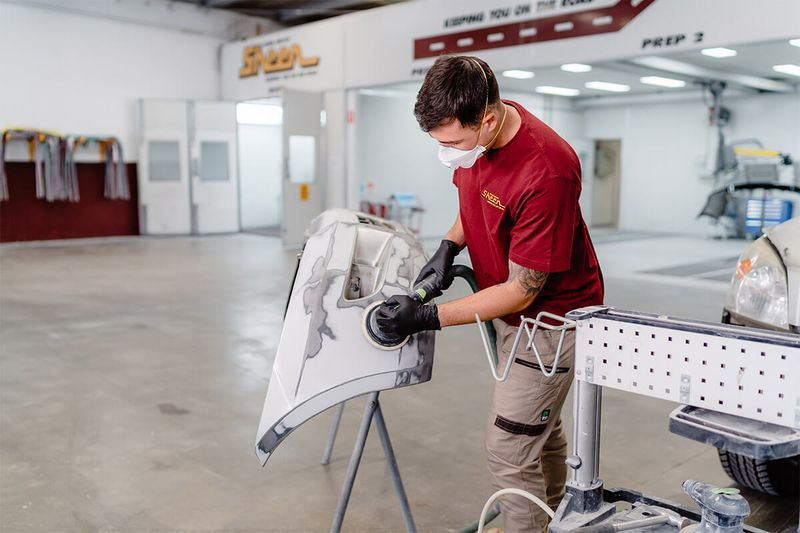
Close-ups and detailed shots of your team completing different services are incredibly useful. They allow you to fill in image gaps next to content about specific services. They also allow you to show exactly how you deliver a service instead of trying to find mediocre stock images that only kind of seem accurate.
Make sure uniformed staff are in the shot and that you also include your branding in the frame, even in the background, like in this image from Sheen’s website:
Add videos or virtual 360° tours
Videos and virtual 360° tours enable your website visitors to see and feel more than static images do. For example, this video showcases how Bax Clean delivers a variety of window cleaning services:
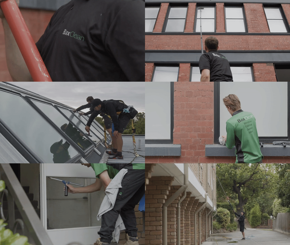
In a matter of seconds, visitors can see things like the team’s attention to detail, their ability to clean windows on multi-story buildings, and that they are also able to clean skylights and windows on a roof.
A virtual tour may be another alternative worth exploring if it makes sense for your business. Here’s an example from Matterport, a property marketing company that creates virtual tours allowing their clients to showcase different types of display homes and properties online.
Adding internal links or mentions to the services you offer in each area allows you to do a few things:
- You can improve the local optimization for these services by targeting “service + location” keywords people are searching for.
- You can give your visitors a sense of exactly what’s on offer at each location.
- You can add custom information, discounts, or offers available to the local market and prioritize what they care most about.
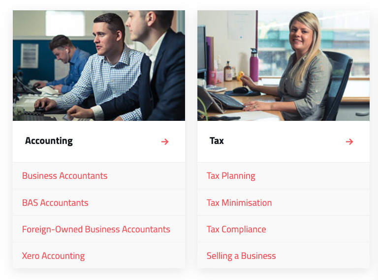
In terms of design, you can have an internal link component taking the visitor to dedicated service pages for the location:
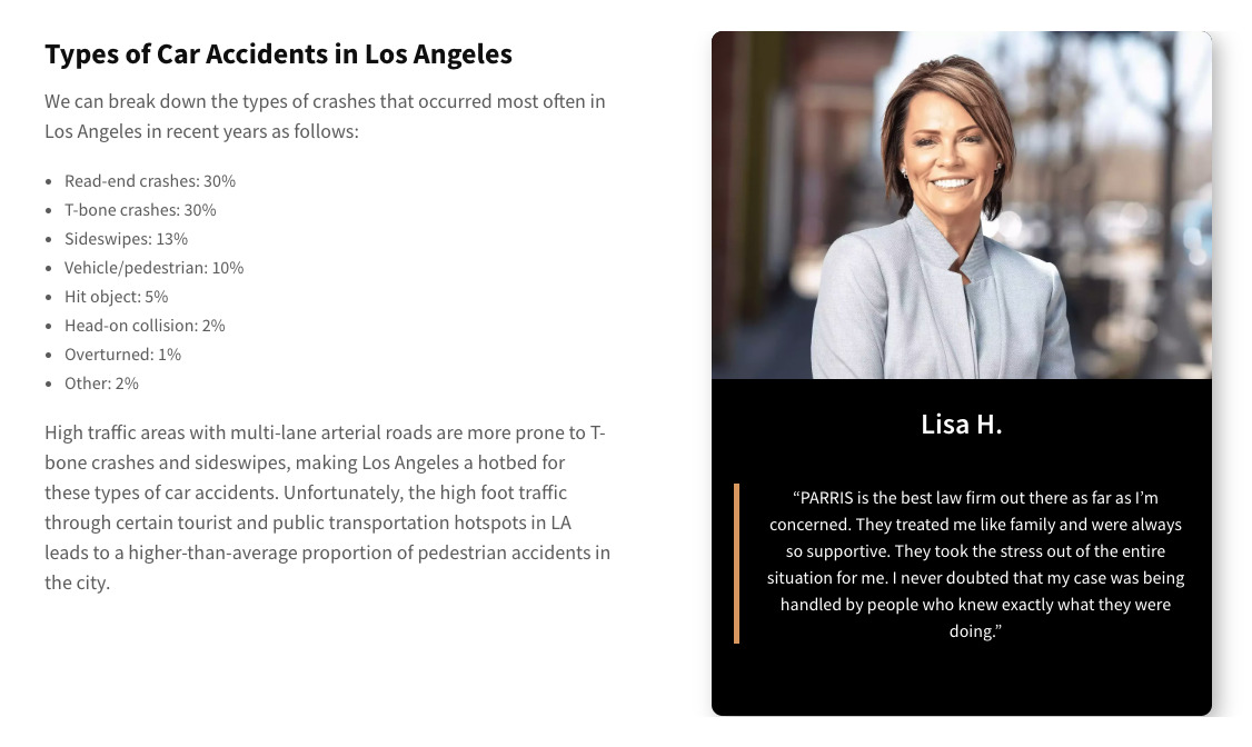
Or, you can have more content about each service on the page, allowing you to rank the location page for all available services in the area:
Demonstrating your credibility is becoming increasingly important online. One way of determining credibility is through experience, expertise, authoritativeness, and trustworthiness (EEAT) signals.
These signals are also becoming more important for SEO as Google continues to focus on prioritizing trustworthy content.
EEAT and credibility elements to consider adding to your location pages include:
- Aggregated ratings from third-party platforms, like Google Reviews, FaceBook, or Yelp.
- Accreditations and certifications for your industry, like FIFA accreditations for football stadium turf.
- Government-issued ratings or licenses, like ISO certifications or industry-specific licenses.
- Location information such as address, contact details, and opening hours.
- Details about the local staff members to showcase their industry experience and expertise.
- Links to your business and social profiles like Google Business, FaceBook, X, or LinkedIn.
- Before and after photos, results, case studies, and local client success stories.
Final thoughts
Google’s continuing emphasis on surfacing credible, trustworthy brands challenges us to rethink location pages that will continue to rank. It’s about transforming our location page strategies from mass-produced doorway pages to credibility powerhouses offering useful localized information.
This shift meets Google’s criteria and creates a more engaging and trustworthy space for our users, especially as businesses begin showing (rather than telling) exactly how they can best serve a local community.
If you’ve got any questions or location page insights to share, reach out on LinkedIn!
